


There is one element of a suitability report that often can make or break it, writes Grant Callaghan, Paraplanning Techspert, The Verve Group

We all know what has to go in a suitability report, and the eternal struggle has always been between keeping them as short and concise as possible and making sure you cover everything you need to cover. The way a report looks, appeals to the client and reads is something that I don’t think is covered anywhere near enough.
It’s easy to put together a report filled with text mixed in with a couple of simple tables. This is probably alright when dealing with half a dozen or so pages but if we’re going to be issuing much more content, we owe it to the clients who read these to step up the experience for them.
It’s not as hard as you might think to improve the way your reports look. You don’t even need a specific designer’s eye to do it either. There are lots of little tips and tricks available to use in Word and it is worth exploring what you can actually achieve while using the humble little table feature. It’s not an obvious design feature (except to help you organise data) but can be manipulated to structure content in a way you want it to appear.
When you would use it
The biggest stumbling block, at least in my experience, of trying to organise content, data or lists in a document away from the standard default is the level of skill you need to develop and the issues you find when you change something later and it throws everything out.
With skill, you would need to get used to using columns, text boxes, page/section breaks, and you would need to potentially understand how ‘wrap text’ and send to front/back work when dealing with shapes, images and icons. These aren’t particularly difficult to learn but they do take time. You can do a lot with these so if you want to take documents to the next level, they are natural areas to focus on.
Manipulating tables can let you achieve the visual and design look of the other concepts I’ve mentioned. You can however with tables find it much easier to make the document less prone to visual errors that might otherwise crop up when you go back and add/reduce from a certain section.
Invisible tables
Tables have obviously been a staple of Word reports and are something that most users should be reasonably familiar with. Using tables as a design element is probably much less common and we can turn the borders white and make them invisible as a way of designing our reports.
As long as you don’t get into the advanced settings of the table, they will always follow the rules of standard text in terms of where they start on a page and how they interact with additional text before and after. The borders are always expandable and collapsible on both the top and bottom, and the left and right border. This gives you a way of forcing text to ‘anchor’ where you want it to.
There are creative options available, i.e. drawing in or expanding the left/right borders to achieve the look you want. As you can set content within a single cell table it becomes even easier to affix certain additional content you want to include into a report without potentially throwing the rest of the report out of position.
Even if you are not including any pictures or icons you can potentially find use for invisible tables as a way of breaking up text in the report and spacing certain things apart. See below:

Once you are done with the setup, you can remove the borders:
What makes this approach appealing is how everything inside a table is unaffected by what happens before or after. You can strip out or add things and the tables and their content will remain how you’ve set it up (the only issue you will find is fitting things onto a page and having to deal with white space if you push a whole table onto the next page).
The table colours can be changed to further bring life and visual appeal to the content. You could have invisible table borders and a shaded background colour.
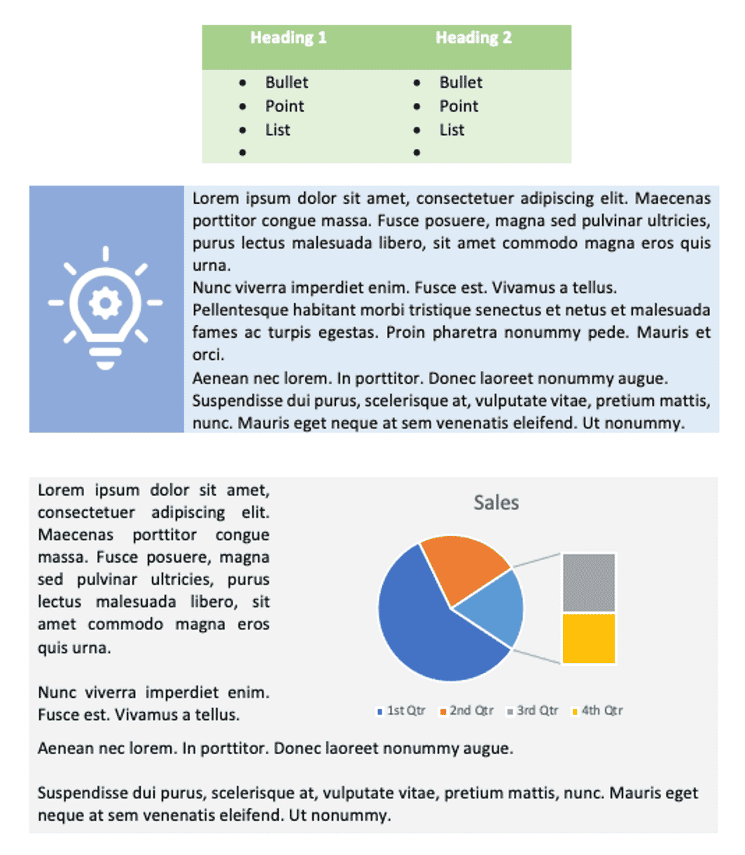
This should show the relative ease in which you can break things up with tables and use them as a way of introducing a (controlled) range of colour into the document.
Conclusion
Suitability reports are hard to read for clients, more so when they appear more like a long form letter and talk about subjects that really do not come naturally to the vast majority of the readers. Introducing some white space or breaks in the text will boost engagement and stop people giving up before they’ve really got into it.
Using tables to create this white space and breaks between text, and giving you a chance to add colour and space for imagery/graphs will further improve the engagement you get with letters. With an increase in reports being provided electronically, the printing constraints on including colour and charts should affect less clients and you might find yourself able to provide reports with extensive colour to those being sent a copy electronically with the colouring turned off for the hard copy print outs. The layout and format of both should be similar keeping the structure consistent across clients.
At the Verve Group we incorporate this and other concepts into the templates we use as part of our paraplanning service and within the templates we create for firms to go away and use themselves internally. The feedback we get on both sides suggest improving the look and feel of your documents goes a long way to improving client engagement with the reports they get. We also hear of the benefits in incorporating brand identity into the suitability letters. Firms have the website, brochures and guides all in sync with their brand so why not suitability templates?
You can find out about how we can help HERE.
[Main image: mohamed-nohassi-_U8RyuBtvQU-unsplash]