


Technology has the ability to make our jobs and lives so much easier. But when do all the bells and whistles actually become a bit of a barrier? Iress wants to know, says its training manager, Sarah Atkinson.
Picture the scene. You’re sat at your desk. Your commute in was unhindered. You got a space on the ground floor of the car park. Your morning skinny capp from your favourite coffee shop has just the right amount of foam, (or a proper cup of tea if you’re from Yorkshire like me!) Then, you fire up your computer and a message pops up cheerily informing you your software has upgraded overnight.
You now can’t find the widget you need, or thinking of a recent social media platform upgrade, you don’t even know how to sign out of the blasted thing. Your perfect start to the day just took a frustrating nose-dive. You might even mutter to yourself “do these product designers actually talk to the people who use this system?” I’m sure we can all relate to a similar scenario.
We are creatures of habit, quite used to having things work the way we expect them to. We know how to find our way from A to B, and that’s what makes any software pleasurable and delightful to use.
For a long time we’ve been focused on delivering all the functionality our clients require to deliver their best. Tony from Leeds needed another filter on that Management Report and Michelle from Margate needed the Factfind to capture that extra bit of compliance information. While this approach helped Xplan to become the software it is today, it has also meant that our users have found getting to where they need to go, sometimes harder or more clicks away than it absolutely needs to be.
This can also mean its wealth of functionality can sometimes be missed. I have lost count of the amount of times people have said to me “Well I never knew it could do that,” when the button has been on the screen in front of them, crying out to be clicked for years. They’ve just never pressed it!
Have a look now at the systems and screens you use the most – how many icons can you see that you have no clue what they do and you’ve never clicked? There could be so much available to help you work in a much more efficient way. That is exactly what we want to unlock and make easier. We don’t want those lonely icons and hidden menus that no-one ever clicks. We want you to be able to work out exactly what they do and how to use them in a simple way.
Software that’s easy and intuitive
For users who’ve thought, “if only I could search for the area i want rather than scroll through all those sub menus,” or, “why can’t I track my new business opportunities in a visual way?”
This is the kind of feedback we want. We want our clients to tell us about the things they would like to make life easier. It’s why we launched Iress Labs and our new user community. I’ll explain later how you get involved. But how it works is we take a concept or idea and place it with users. It’s what we’ve been working on for over a year.
The real world experience of Xplan customers and subsequent adviser testing has been invaluable in shaping the latest software, enabling us to focus on the areas most important to users.
The result is a series of updates to make your lives easier. First-up our new navigation. Lifting the left hand menu and introducing smart searching, then revamping the opportunity area enabling new business opportunities to be tracked in a simpler, more visual way.
Using the new navigation
Logging in for the first time, you’ll be presented with a clearer, simple title bar that runs along the top of the screen. Gone are the days of lots of menus, icons and buttons filling the top.
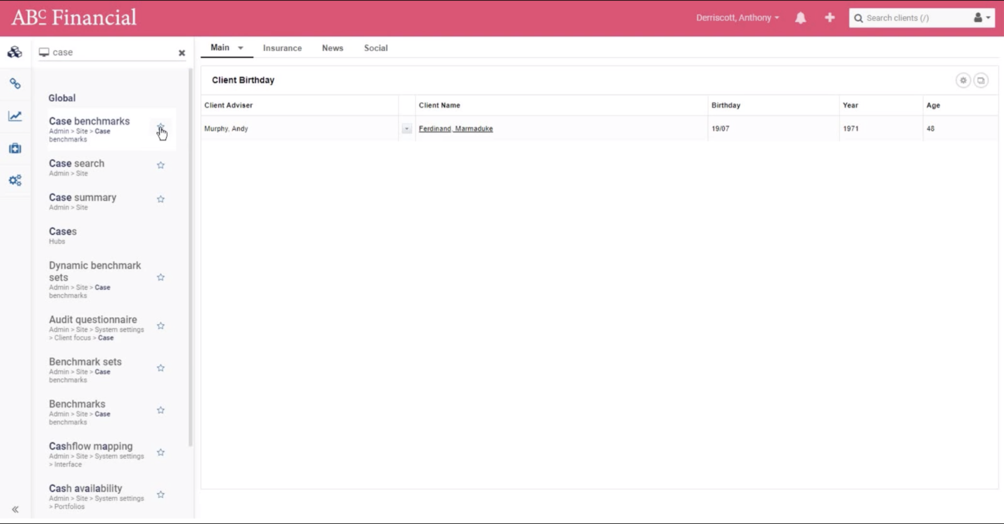
The left hand menu has been formatted based on how our users work. Gone are the top menus, with drop down after drop down. We’ve given them a new home within the left hand menu so that everything is easier to find.
Click in to see My Hubs, which is the most commonly used area of XPLAN. We know what you use the most and we’ve made it more prominent and easy to find and called it Hubs.
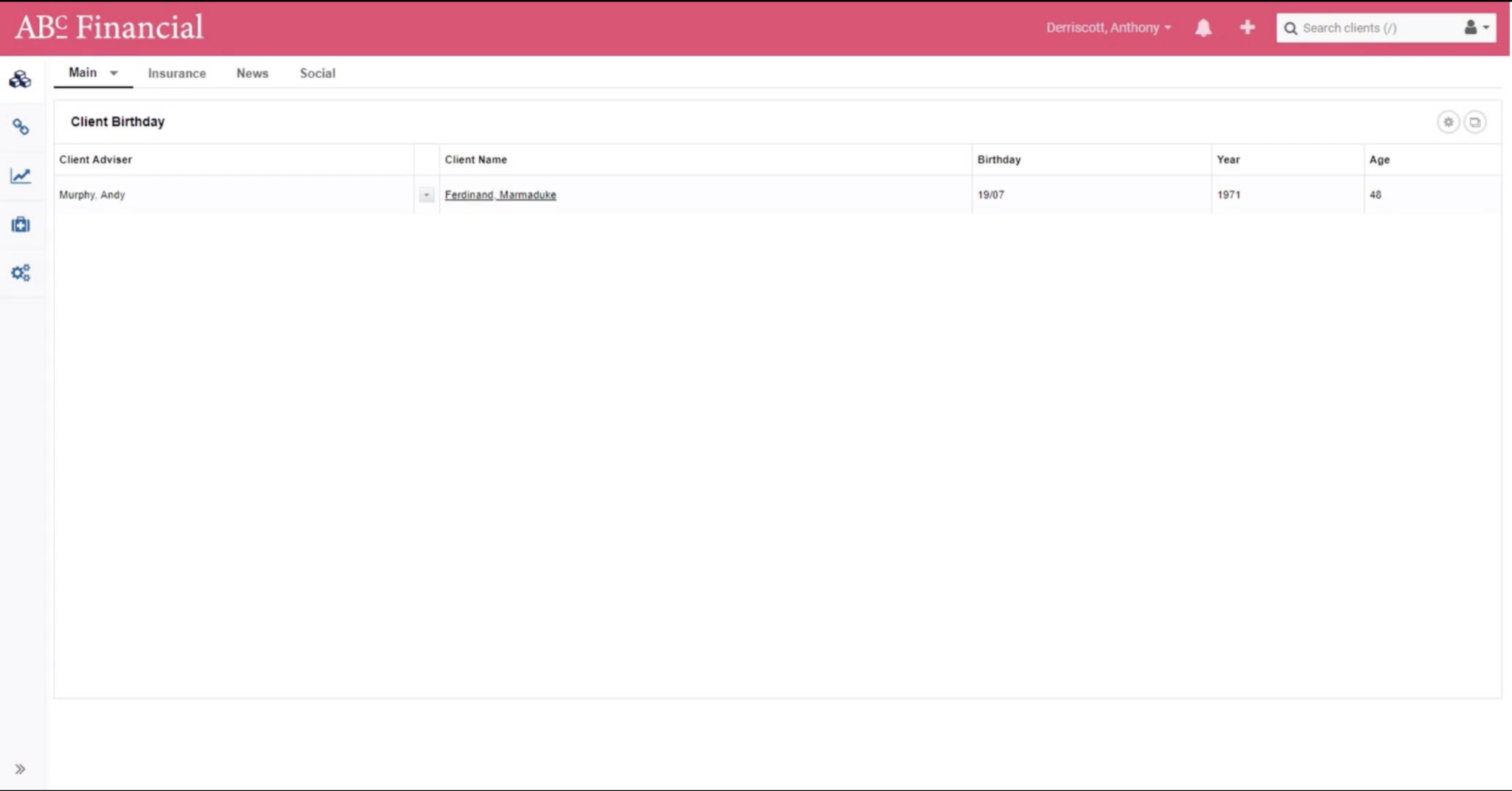
Further in, to the left hand menu, you can find everything you need. We’ve also introduced Quick Nav. All you need to do is type the area or function you want to locate in to the Quick Nav box and it will give you the option to get straight there, saving a good few clicks. You can also add items to your favourites and these will be there to access.
Once you’ve got used to the new left hand menu you’ll be able to see we have improved the way you can search within Xplan. We’ve simplified it again – we’ve listened to feedback and worked with our users to make it easier. Searches are now grouped together to make it more efficient – whether you’re searching by client, users, policies etc. I am sure there are loads of times you’ve received correspondence from providers with just a policy number on – you can now use the search to locate the client and policy really easily.

Our August 2nd release made this new navigation the default view. You will also find you access to our Iress Community, which is a great source of information including help, release notes, training videos, real-time updates, user forum and a place to get involved with Labs. Have a look at our roadmap – make sure you know what we are up to and how you can be involved.
The new navigation is only the beginning. There is a lot of development stuff on the horizon such as opportunity management, KYC ‘know your client’, fact finding and so much more.
Get involved
This collaborative process is our model for the future. It’s helping us give our users an easier, simpler experience when using our software.
Our new communication channel is here to support traditional communication methods, enhance and not replace our face-to-face relationship but, in order for this to work, we need you to join us and tell us what you want to see and why.
Tell us all about them. We want to know. It really is a team effort.